

The Smartlog Group presents its new corporate image. This new image responds to the evolution experienced over the last few years and its vision of sustainable future growth.
Smartlog aims to become a trusted global leader, providing the most innovative intralogistics solutions on an international level and has decided to align its image with the brand values.
Smartlog’s new logo aims to reflect trust, a vital key to the brand. For this reason, the two main concepts have been unified, “smart” to represent the optimisation and innovative contribution of intelligent automation solutions, and “log”, which positions the company in the intralogistics sector. The lower case lettering is modern and evokes a sense of closeness, values that are part of the company’s DNA.
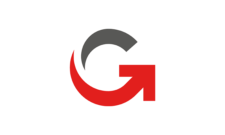
The isotype (symbol) is also made up of two components, thus connecting with the logotype and incorporating the G of Smartlog with a rising arrow, which transmits the company’s values of innovation, evolution and growth. In the logistics environment, directionality is a strong element and the G will lead the way. The open circle represents the environment comprising customers, partners, people, etc., in other words, the world that surrounds it.
In such a competitive chromatic sector, the chosen colour palette includes light, silver and grey tones to transmit technology. Red accentuates the action, conveys strength and courage. Its aim is to capture attention, always trying to emphasise its authenticity with passion and emotion.
This is the image of Smartlog that grows, that follows the path of internationalisation, always with its focus on the future. A future where customers, people, innovation, intelligence, technology and sustainability coexist.
Copyright © 2024 Smartlog. All rights reserved. Privacy policy · Legal information · Cookie policy